The director did a lot of experimentation with film stock, and purposefully chose to shoot on Super 16, Kodak 7229 in order to get the movie’s characteristic dark and dull look. While I agree that this looked amazing in the exterior shots, many of the indoor shots were almost too dark – so much so that there was often not enough contrast to see what exactly was going on. This could have been fixed by use of more lighting, as there were some better-lit interiors that looked just fine. There was also one exterior shot that was very washed out. As the rest of the exteriors looked good, I couldn’t tell if this was done on purpose, or if there had been some sort of mix-up. Either way, it looks very out of place as the convention of a washed-out shot is not employed anywhere else in the movie.
Also, there was very little cutting back and forth and coverage shots – another thing that is normally considered bad filmmaking. I got the sense that this may have been done on purpose, to imply the slow movement, isolation, and lack of attention that occurs in one who is depressed, but the downside is that without enough scene coverage an audience may not realize what is going on. An alternate way of creating this slowness and disorientation without confusing an audience is to incorporate more unique shots – such as high and low angles or shooting from behind objects – and creative editing – cutting from a wide shot to an extreme close-up, or cutting to a shot of a character or nearby object in the midst of another character’s monologue. These types of things are not “normal” conventions, but they can be employed to set a mood. (Take a look at the film The Score and make note of its many unique camera angles and lighting setups, especially the money exchange scene that takes place in a park. Director Frank Oz purposefully shot many of the scenes behind branches and trees and had extras walk in front of the camera – something that would normally be considered bad filmmaking, but it gave the scene a wonderful surreptitious feel.)
I noticed that the motion of the film seemed to speed up or slow down on several occasions, which I’m assuming may be an editing glitch. I’m not sure if that could be fixed, but perhaps some close attention with Final Cut or any other advanced digital editor could tweak it enough to get rid of these issues.
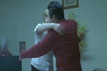
One thing I really loved about this movie was the montage at the very end – tension has been building up throughout the film, especially as every scene in which Jay injures himself progressively reveals more and more to the audience. The montage shows Jay going through his routine of turning the stove on and getting his knife ready (also a nice touch, as self-injury is often a very ritualistic act to those who do it), and this image is intercut with shots and sound clips of all the things that have been eating at him and making him want to continue to hurt himself. This montage is really a great pictorial depiction of the turmoil that goes on inside the mind of an individual just before hurting themselves – many people need to do it as a way to calm themselves down and quiet their overwhelming emotions. The shots of Jay just about the burn his arm aren’t graphic at all, but they still cause an unconscious cringe to the audience – especially to those who have personal experience in this area. Ultimately, Jay stops himself and appears to take a step in the direction to actually get tangible help for his problems, which is a really great way to end the movie.
Use of Audio
There was some really nice piano music in this film, but it only appears on occasion. It did a lot to help set the mood, and I would have liked to hear more of it – perhaps even other versions of the same song on different instruments, as a depressed mood sometimes tends to have a sort of “theme song” to it.
In fitting with some of the odd visual cues where the images didn’t seem to make much sense, there were some instances where strange sound bites cropped up – often one playing on top of the other. While this helped to add to the disorienting effect, it was often hard to understand what was being said or even what the purpose was. Some viewers may get the sense that Jay’s character hears voices, which I don’t believe is the case, while others may feel that it’s just a convention to make him appear to be going “crazy,” which also doesn’t seem plausible. Trying to depict a mental illness on screen is a very difficult task, and it’s easy to create misunderstandings. Sometimes filmmakers will collect a number of “crazy conventions” such as multiple personalities, hearing voices, self-injury, etc. and combine them all together, just to make their character seem crazier (which is certainly a massive disservice to all who actually deal with mental illness). I don’t believe that the director has done this at all, however an audience might possibly get the wrong impression.