Visual Look
When interviewing people for a documentary, you want the location to in some way reflect who the person is or what they do. However, the locations chosen for the interviews in this film are at best nondescript, and at times confusing. For example, the interview with Luke’s doctor looks like it was recorded at his house; there are personal photographs on the wall and untidy stacks of papers peeking out from a side shelf. Especially for doctors and lawyers, the background needs to reflect some aspect of professionalism; although the change may be subtle, it has the psychological effect of giving an air of credibility to the person in question. (“They must really know what they’re talking about; look at all those certificates!”)
A better choice would be to seat him in a comfortable chair in front of an appropriate background; perhaps place a few official-looking degrees or certificates on the wall or place him in front of a tidy bookshelf of academic-looking books. However, be sure that the background is not too distracting; this can be achieved by keeping it slightly darker and out of focus from the interview in the foreground. (Additionally, make sure that professionals are dressed appropriately for their position. This may sound cliché, but having a doctor or lawyer in street clothes undermines the feeling of legitimacy to them as interview subbjects.) The two interviews with Sheree (Luke’s mother) were confusing, because they were back-to-back, but in different locations (one indoors, one out), with different outfits (one dressy, the other casual), facing opposite directions. This can be easily remedied by either:
doing each person’s interviews in one location at one time or
separating the interviews with additional footage, photographs, etc.
NEVER use autofocus, because
it can change mid-scene...
...and always balance your shots to
keep them visually engaging.
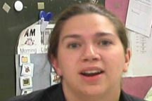
The camerawork was quite problematic; in several places it was shaky, and in others, it was out-of-focus. The autofocus option was apparently used, because the camera would sometimes try to re-focus in the middle of a scene or interview! This is a huge no-no! Autofocus is for family holidays, birthdays, and vacations… never for a professional film. (Especially since the XL1 that was used to shoot this film can readily be switched into manual mode.) Inconsistent and poor framing was also an issue, particularly in the interviews. For example, in his interview, Scott (Luke’s father), is seated 2/3 of the way to the left side of the frame, and his body is facing the left side of the screen! This leaves a huge amount of “empty space” at Scott’s back, and gives the impression that he’s turning away from the screen (and thus, the audience).
Finally, the director used photos and graphics to help tell Luke’s story. While this idea was helpful, they need some additional work. None of the photos appear to be scanned in; while this is not an issue for some of the pictures, there are several that are clearly crooked and/or off-center (including one that is re-centered in the middle of the shot!). Even if the filmmaker wasn’t able to get a scanner for the pictures, there are other creative solutions available. (For example, vertically mount the photos to a piece of black posterboard and film them that way.) As for the graphics, the title cards need to be visible, but should not cover up any footage. Instead of a full-screen card, put each bulleted point at the bottom of the screen.