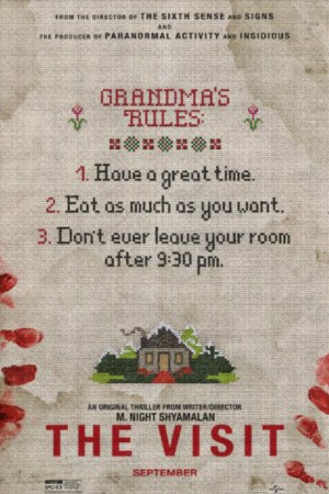
 Director: M. Night Shyamalan
Expected Rating: PG-13 (for disturbing thematic material including terror, violence and some nudity, and for brief language)
Distribution: Universal/Blumhouse
Budget: $5,000,000 (estimated)
Genre: Horror/Comedy
Release Date: September 11, 2015
Official Website: Click Here
Trailer: Click Here
Purchase: Click Here
Running Time: 94 minutes
Critique Issue: #117 (12/15)
Critiqued By: Manuel Crosby
Overall Score: 9.2 (out of 10)
[Editor’s Note: Special Critiques are reserved for films that are technically made for a higher budget than the $50K cap that MFM critiques films at, but which preserve the spirit of Indie filmmaking. In this case, it’s with a film that’s a sort of redemption tale for an Indie minded filmmaker that lost touch with himself for awhile.-JH]

M. Night Shyamalan broke out in Hollywood with some original, well-received, and healthily-budgeted films like The Sixth Sense (1999), Unbreakable (2000), and Signs (2002). However, many viewers have been far less satisfied with his more recent works.
Regardless of audience opinion, Shyamalan has remained a high-budget filmmaker- which is what makes his latest project so surprising. With The Visit, he instead tells a small-scale story on a tight budget, using only a handful of actors and locations. And the result: an extremely satisfying blend of suspense, scares, and comedy.
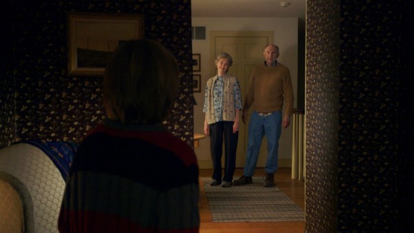
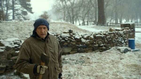
When two children, Becca (Olivia DeJonge) and Tyler (Ed Oxenbould), visit their grandparents (Deanna Dunagan, Peter McRobbie) for the very first time, it seems like a great chance to connect and have fun with long-lost Nana and Pop Pop. But before long, the children discover that their grandparents act more than a little strange after 9:30pm. What happens when this cheerful visit turns terrifying?
Content
Shyamalan delivers a very well-written script this time, with fully-fleshed characters and a story that works on both entertainment and emotional levels. In fact, one of the many joys of this movie is seeing how monetary restraints require a filmmaker to fire on all cylinders with these basics. All members of the small cast give excellent performances; the sibling bond between Becca and Tyler feels genuine, as does the struggle of the grandparents battling the obstacles of old age. Furthermore, they have great timing with the comedic material, using both line delivery and physical acting in hilarious ways.
Though the movie draws out laughs and thrills, it still emphasizes the poignant emotional journeys of the characters. Many low-budget horror films ignore this, yet Shyamalan never shies from it. We see how past family conflicts have affected each character individually. The normally cool and composed Becca breaks down in tears after being interviewed by her brother about her father, who left when she was small. We also see Nana’s emotional struggles when asked about why Becca’s mother (Kathryn Hahn) hadn’t spoken to her in so many years. These elements make the movie much more involving than if it were simply a series of laughs and screams. And, these are traits that any filmmaker can use to better their own stories.
The pacing of the film is mostly spot-on. Shyamalan takes his time setting up the pieces, including a number of plants and payoffs that are too good to spoil. At times, deliberately slow scenes linger just long enough to build the tension to its peak. During a scene revolving around an oven-cleaning turned sinister, Shyamalan doesn’t speed up the proceedings, resulting in a blend of absurd comedy and nail-biting suspense.
With that said, there are a few moments that don’t quite work because they are overplayed. Some of Tyler’s amateur freestyle raps, for example, while funny at first, lose steam after repetition. Cutting them down somewhat would amplify the humor. In fact, another recurring joke involving Tyler’s substitute swear-words serves as a great example for successful humor because it emerges briefly, sporadically, and at the perfect moments.

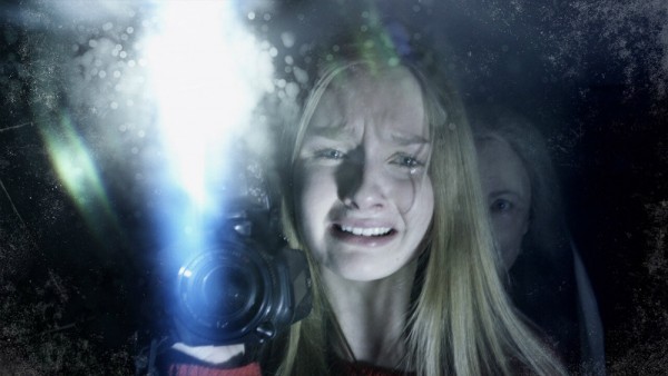
Becca and Tyler try to tell their mother that something strange is going on… but will she believe them?
Overall, the film moves well, and in the third act it completely lets loose, unleashing hilarity and terror in equal measure, with the conclusion of the film definitely satisfying me. The emotional arc wraps up nicely, though the energy slows down a little early for my taste, but the rest of the ending kicks into top gear. It delivered far more than I expected going in, and had me talking about it long after the credits rolled.
Visual Look
One might expect the faux-documentary approach (well-worn by this point) to handicap the intentional, polished craftsmanship of Shyamalan’s typical visuals. However, with the aid of cinematographer Maryse Alberti, M. Night incorporates these traits into the documentary style without missing a beat. By making Becca an amateur filmmaker with a thirst for shooting “art”, the filmmakers can capture evocative imagery that fits with the story because it fits with her perspective. These shots also contrast nicely with Tyler’s haphazard shooting style.
Furthermore, Shyamalan uses the tool of perspective to his full advantage. By putting cameras in the hands of multiple characters, he highlights what each person can or can’t see at the same moment in relation to each other. Also, the camera is not entirely handheld, but often views the action from a tripod or other surface that the characters set it on. This allows Shyamalan to utilize his trademark of ominous, off-kilter frames that simply hold on scenes to build suspense.
Also, Alberti crafts some great, naturalistic lighting, adding atmosphere without feeling intrusive because the lighting flows from the environments being shot in. Mysterious, ominous moments often play out in shadowed spaces, adding to the dread. Furthermore, the choice to shoot in winter aids the atmosphere, with the snowy landscape and rustic farmhouse resembling a dark twist on a holiday greeting card. This harmony between visuals and location also comes through the work of production designer Naaman Marshall, coupled with location planning. Microbudget filmmakers should take note on how important this synergy is to the success of a film’s visuals, and use the knowledge for their own projects.
Use of Audio
The sound design of The Visit is excellent, which is key for documentary-style movies–as many learned through the Blair Witch Project. Though the audience will forgive intentionally shaky visuals, bad audio will always throw them out of the story.
Very creative uses of sound design amplify the suspense. In one scene, the simple sound of water running through pipes gradually rises in intensity as the level of terror grows, putting the viewer completely on edge. This is a great way to avoid a traditional music score (this movie almost totally lacks music), and also mirrors the feeling of heightened awareness that a person would feel in a very scary situation.
All of the dialogue and effects in the film are clean, intelligible, and effective. The filmmaking crew certainly took great care to capture the best possible production sound.
Use of Budget
The team behind The Visit made the movie very well on their relatively small budget (by Hollywood standards) of $5,000,000. The production values impress for the cost. However, I do feel that the filmmakers could have pushed even further into microbudget territory, had they really wanted to stretch themselves. This story could truly be done for even less, because the script is strong enough to support it. The filmmakers chose to spend the extra money on added touches like great sound design and visual flair. They were also undoubtedly working within union regulations, which require higher salary rates for cast and crew. These extra elements were true advantages to the film, but I still wonder what could have been created using the same script under even leaner financial circumstances.
Lasting Appeal
This movie holds excellent rewatch value, and contains at least one unforgettable moment that viewers will want to relive. I have seen the movie twice myself, and love recommending it to friends. It certainly inspires some fun conversations with people who have also seen it!
Overall Comment
The Visit delivers a truly enjoyable time at the movies. At each screening I have attended, the crowd laughed, screamed, and shouted along with the characters the whole way. Though it contains some small flaws, it is truly engaging- the hallmark of a really good film. It also serves as an interesting study for microbudget filmmakers on how to hook audiences with limited production resources. I feel that more seasoned filmmakers should go back to their roots, strip away the massive budgets, and work on small-scale projects. It would be very interesting to see what more filmmakers from Hollywood could come up with if they did so. I’m glad M. Night took this approach and gave us a great, entertaining film!
|
Breakdown
|
|
|
Content
|
9.0 |
|
Visual Look
|
9.5 |
|
Use of Audio
|
10.0 |
|
Use of Budget
|
7.5 |
|
Lasting Appeal
|
10.0 |
|
Overall Score |
9.2 |
| How do we critique films? Click Here To See. | |


