 Director: Manuel Crosby
Expected Rating: PG
Distribution: Self-Distributed
Budget: $175
Genre: Suspense-Thriller
Release Date: February 6, 2015
Official Website: Click Here
Trailer: Click Here
Online Version: Click Here
Running Time: 18 minutes, 3 seconds
Critique Issue: #110 (05/15)
Critiqued By: Jeremy T. Hanke
Final Score: 9.2 (out of 10)
Long time readers of MFM will quickly recognize Manuel Crosby as the director who made Broadcast, a surreal survival-thriller a couple years back. With “Precaution,” he’s back with another thriller, but this one in a modern urban setting.

Henry (Dave Reimer) is an unemployed architect with a very pregnant wife, Shelley (Amy Lynn). Unable to find a job, he becomes obsessed with a criminal who’s broken into a nearby house and killed the owner. To try to protect his family, he decides to take precautions. But will he be able to anticipate the events those precautions will set into motion?
Content
The writing for “Precaution” is very terse, with most of the dialogue coming from the news casting and Henry and Shelley’s conversations revolving around that. The acting was very believable from both the leads, which is especially impressive for Ms. Lynn, who was a last minute replacement when a previous actress became ill. While a little more life to the newscaster’s deliveries would’ve helped a bit, they were believable enough that it never pulled me out of the drama unfolding.
The conclusion works quite well of asking “when do precautions go to far?” without offering black and white answers in response. This is especially important for short films that do best at asking open-ended questions!
Visual Look
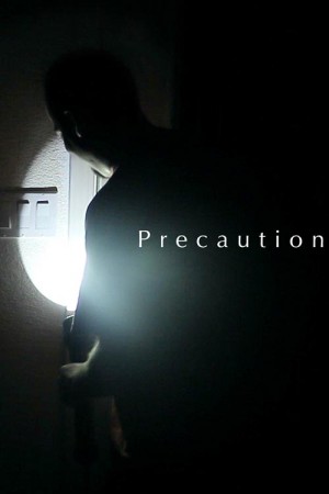
The visual look in this film was very impressive, especially considering the extremely meager budget and the fact that a lot of the film is “apparently” lit with a flashlight. (As we all know, additional illumination is always required to make things appear to be lit only by a single light source, even to light sensitive cameras like the Canon 60D they were using to shoot the film.)
Through this style they were able to give the spookiness that was achieved in movies like The Blair Witch Project and multimedia games like Slenderman. And, despite the use of a camera that’s designed to look handheld, they actually created a pseudo-stabilizer with a tripod that helped the film stay very watchable—rather than a takeoff on a Paul Greengrass migraine-inducing Bourne film!
The only time the lighting didn’t quite work was a midnight scene that cuts from him sleeping to a very dark room. It’s so dark that at first it appears that the film has glitched and it’s a black screen. Bringing up the gain a little bit will help that feel more intentional, as will cutting to few different angles rather than just leaving it on that one shot so long.
One suggestion I might make for future films that use this sort of lighting/visual reveal style is to make an intentional difference between indoor and outdoor. Right now, there’s a scene where Henry walks from indoors into the outdoor world, and the lighting is almost identical outside as inside. Even though, that’s how it really works in the real world, stylistically it’s often helpful to create visual parameters that separate two different environments. For example, if the inside of the house is supposed to be spooky and dark, the outdoors is brighter (through streetlights and other houselights); contrarily, if the outside is supposed to be haunted and dark, then running into a building should be brighter and warmer (or at least a different TYPE of dark). By adding gelled blue and violet lighting outside when Henry walks onto the porch, it would create a greater difference between these worlds, which I believe would’ve been helpful. (Deep blue and violet lighting helps add illumination that reveal things while still “feeling” dark because of their color temperature.)
Use of Audio
The dialogue is clear and easy to hear throughout the entire movie. (The only exception is the second line from Shelley, which seemed a bit soft, especially since it was right after an announcer who was much louder.) The sound effects and sound design are really impressive throughout the film. Mr. Crosby’s choices of focusing on audio over visual is one that I really appreciate, because it’s so powerful.
While there is a little bit of score early in the film, for most of the spooky portions of the film, they opt to remove the music and just use the sound of breathing, and when approaching the outdoors, the sound of crickets as the soundtrack. It’s an unusual choice for films that feel horror-esque, but it works well.
Use of Budget
This film looks great and sounds great and tells an intriguing story. To do all of that on $175 is awesome.
Lasting Appeal
This is a nice short film that’s interesting to watch and then it’s interesting to show to other people. It’s definitely one that’d be great to show at a get-together and use it to spark interesting discussion about these sorts of situations in the real world.
Overall Comment
Manuel Crosby and his team continue to impress with their creative films that use various forms of outside media to push the pace of their tales. It’s a clever choice that reminds us of how many of our decisions are influenced by the media and broadcasts we consume on an almost constant basis! I really look forward to the next film he and his people set their hands to!
|
Breakdown
|
|
|
Content
|
9.0 |
|
Visual Look
|
9.0 |
|
Use of Audio
|
9.0 |
|
Use of Budget
|
10.0 |
|
Lasting Appeal
|
9.0 |
|
Overall Score |
9.2 |
| How do we critique films? Click Here To See. | |


1 Comment
スーパーコピー商品、ブランドコピ ー財布、偽物バッグコピー財布コピーN 級品、ブ ランドスーパーコピー商 品、グッチ財布コピー,ミュウミュウ 財布激安。ブランドスーパーコ ピー銀座、ランドスーパーコピー財布。ブラ ンドスーパーコピー代引き、ブランドスーパーコピー専門店、ご購入する度、ご安心とご満足の届けることを旨にしておりますよろしくお願いします ありがとうございます
スーパーコピーブランド格安販売店はこちらへ!品々の激安価格に持ったスーパーコピーブランド 代引きの新作はお客様に提供されます。安心、迅速、確実、お客様の手元にお届け致します。★弊社は9年の豊富な経験と実績を持っております。★一流の素材を選択し、精巧な作り方でまるで本物のようなな製品を造ります。★品質を重視、納期も厳守、お客様第一主義を貫きは当社の方針です。★驚きの低価格で商品をお客様に提供致します!★早速に購入へようこそ! http://www.msnbrand.com/brand-copy-IP-1.html